Introduction
Overview
In June 2023, I decided to take my interest in design a step further by enrolling in the Professional Certificate in UI Design with the UX Design Institute, a global leader in UX education. I wanted to build on what I already knew and really strengthen my understanding of UI design principles. Over the course of three months, I completed the program online, gaining both practical skills and fresh insights that have shaped how I approach design today.
Course deliverables
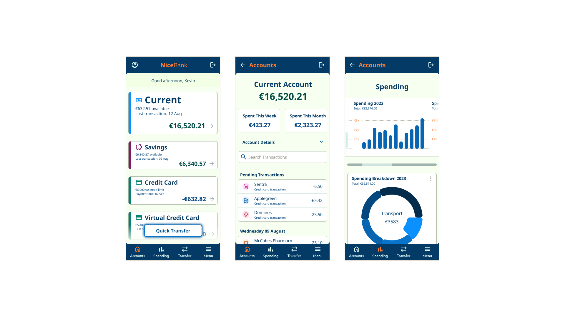
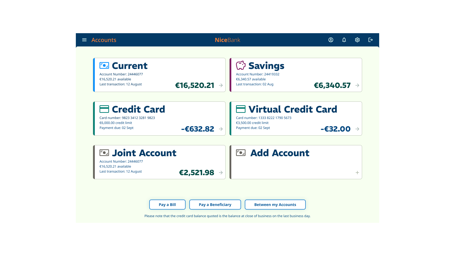
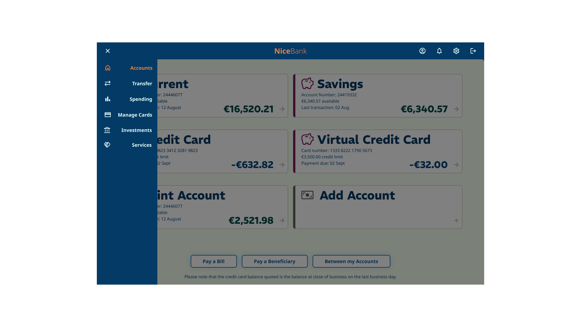
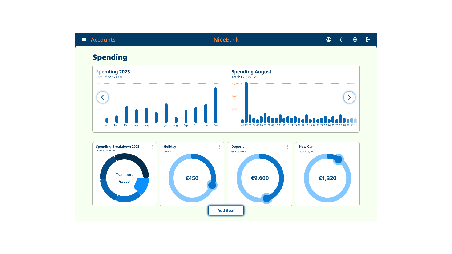
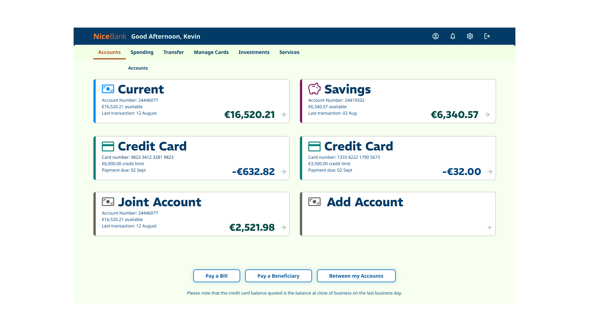
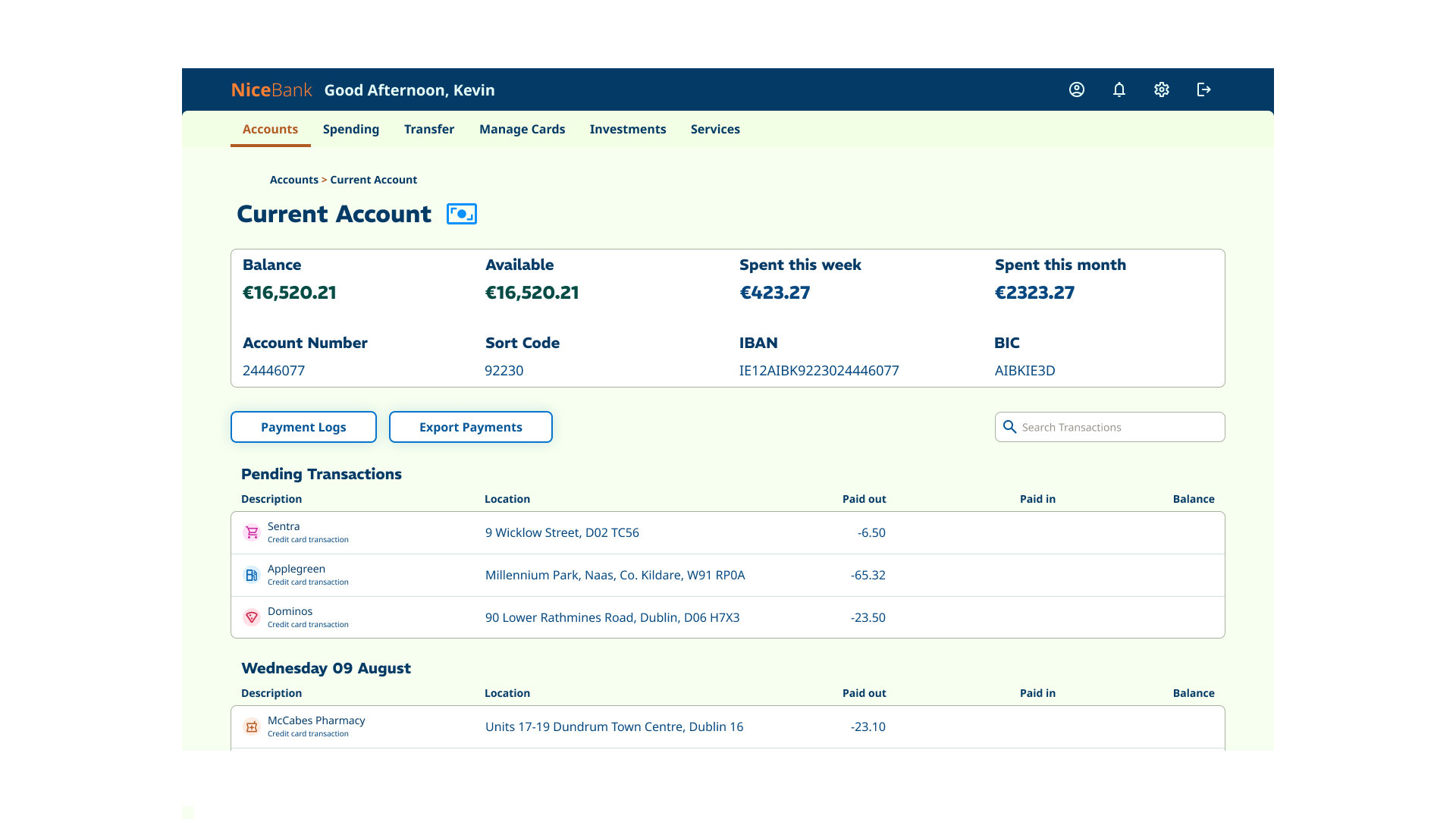
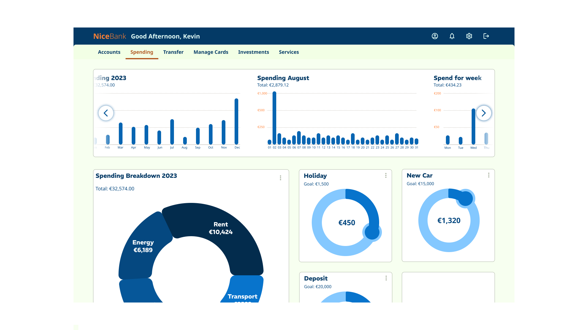
Grading was based on an assignment (40%) and an online exam (60%). The assignment task was to build a number of key screens for a banking app, covering mobile, tablet and desktop form factors. The app needed to convey playfulness, clarity, and trustworthiness.
Course content
The course content covered material necessary to complete the assignment. This included:
- Brand and personality
- Layout
- Design principles & design process
- Interactivity
- Typography
- Colour
- Iconography and imagery
Research
Prior to building out the screens, we were required to:
- create mood boards that demonstrated playfulness, clarity and trustworthiness
- Research into existing banking app solutions
- Research iconography, interactive states and UI components
- Research colour and palette options
- Research typographic options
Mood board creation
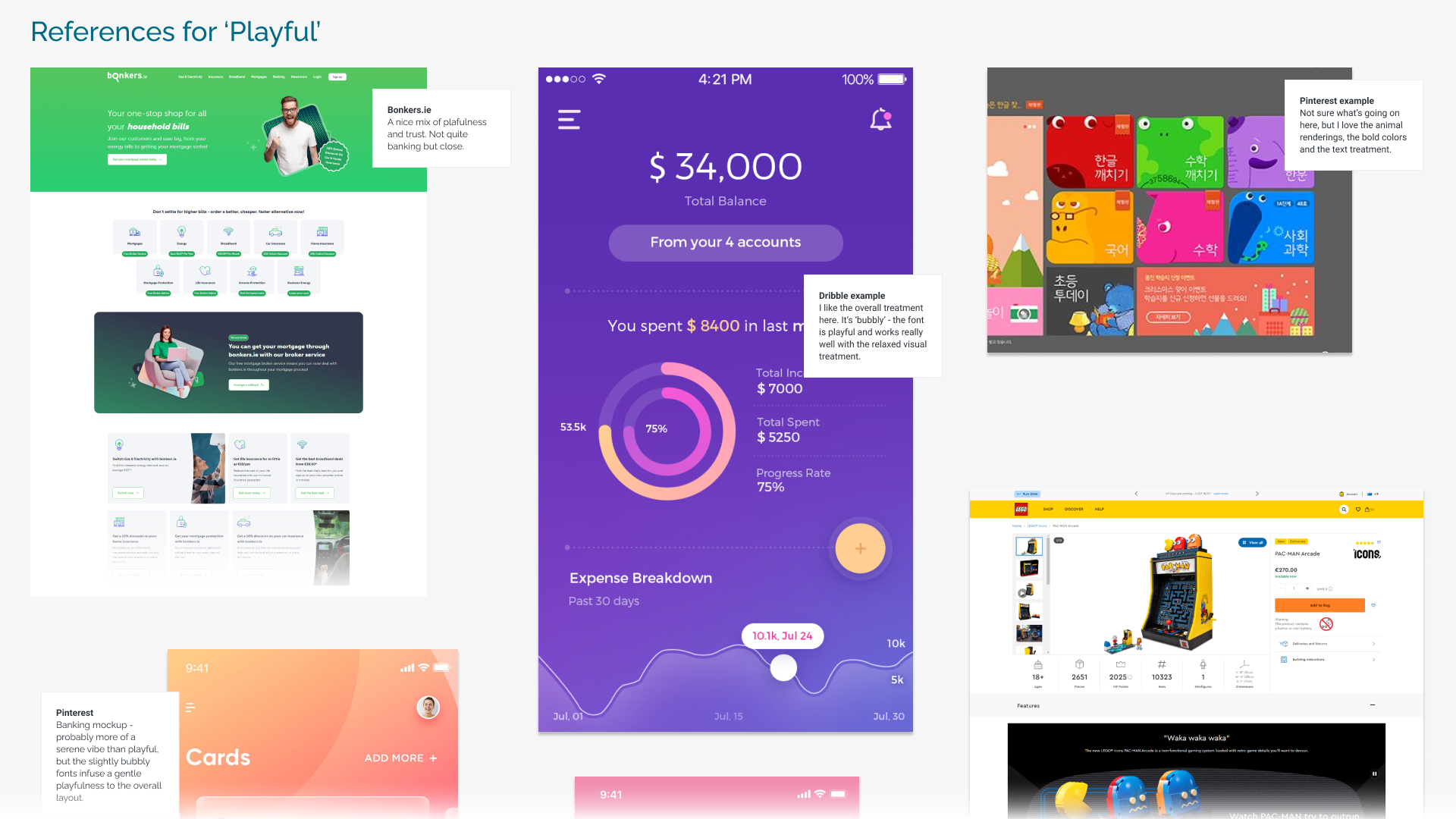
The mood board came together through a deep dive into apps and websites that captured three key qualities: playfulness, clarity, and trustworthiness.
For playful inspiration, I explored Bonkers.ie, Lego, and visual references from Pinterest, Dribbble, and the Moby UI kit – each offering fresh ways to inject energy and fun into design.
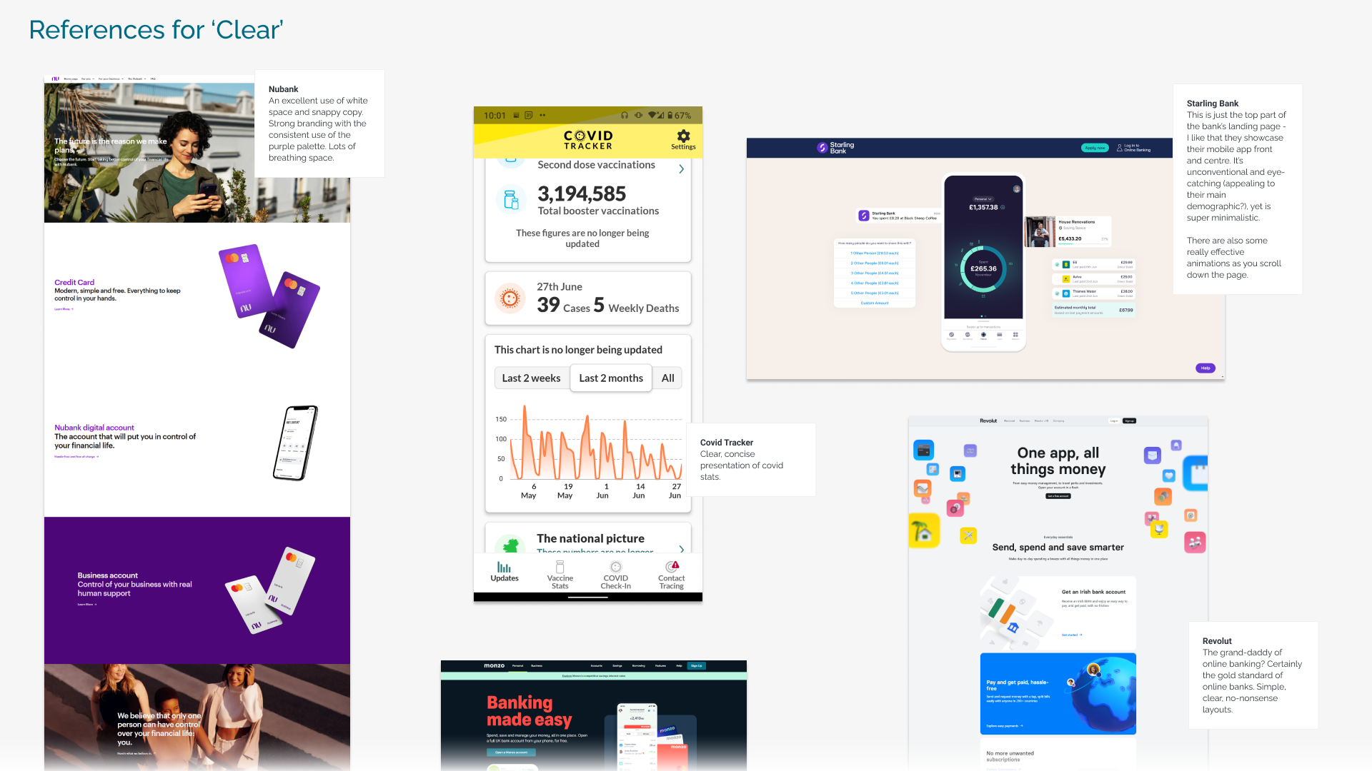
To study clarity, I looked at Nubank, Starling Bank, Revolut, Monzo, and the 4AD landing page. These examples stood out for their smart use of white space, crisp typography, and intuitive layouts—though interestingly, 4AD leaned on serif fonts, setting it apart from the sans-serif-heavy group.
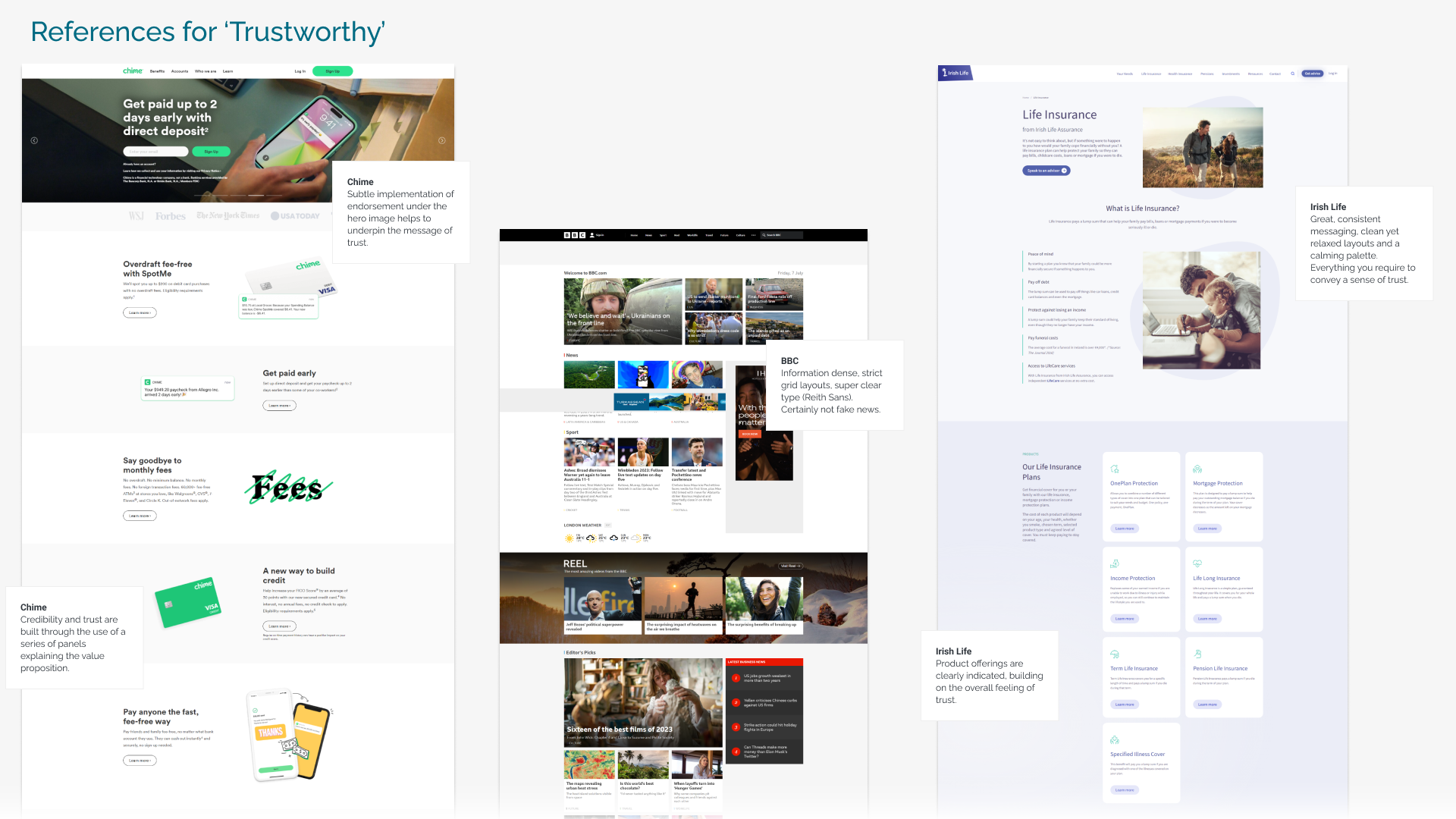
Finally, to bring in a sense of trust, I drew from brands like Chime (with its subtle corporate endorsements), BBC, Irish Life, Santander, and Kerry Group. These references showed how credibility can be communicated through thoughtful presentation and visual consistency.
Alongside these, I also explored font pairings, colour palettes, and iconography — all chosen to reinforce the values of playful, clear, and trustworthy design.
Mood boards
Research: icons, interaction, UI components, colour & type
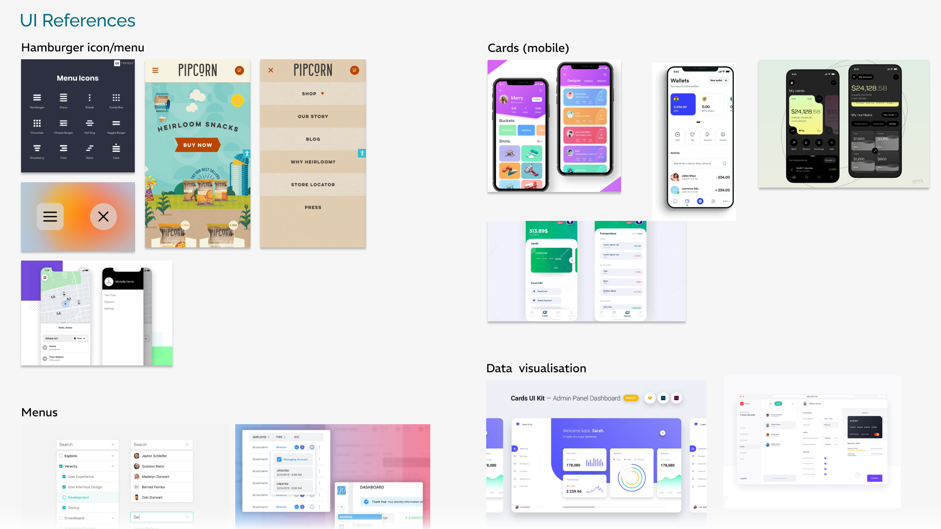
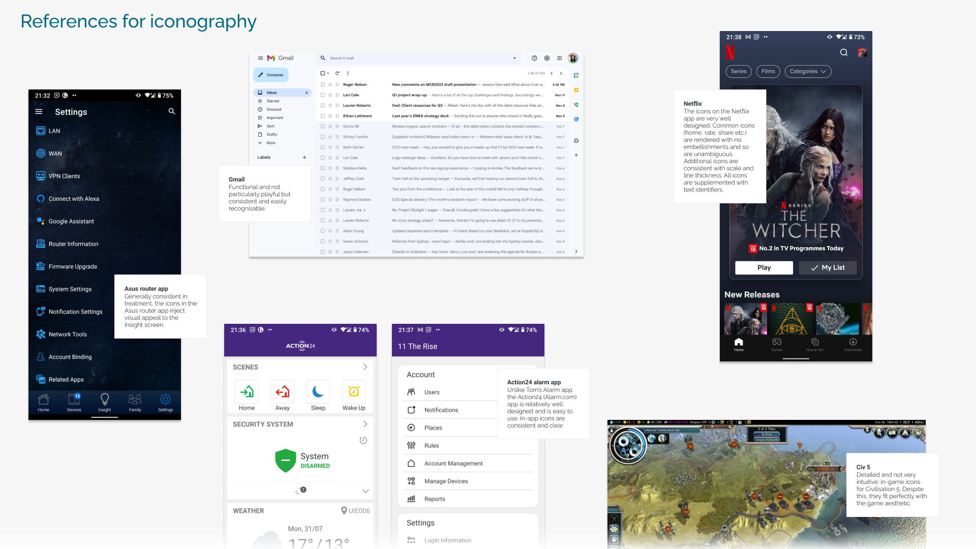
After the first round of mood board explorations, I dug deeper into icons, interactivity, UI components, colour, and typography. This phase was anchored in my earlier research into banking apps and shaped by the three guiding themes: playfulness, clarity, and trustworthiness.
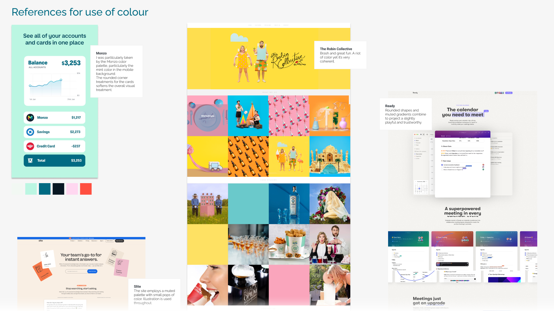
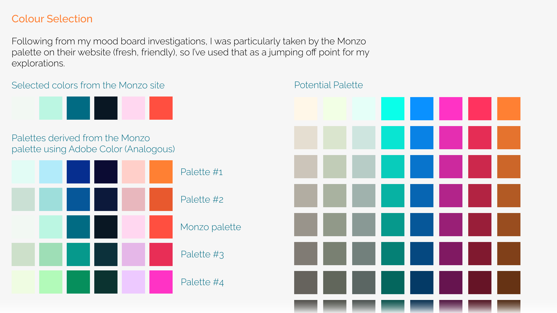
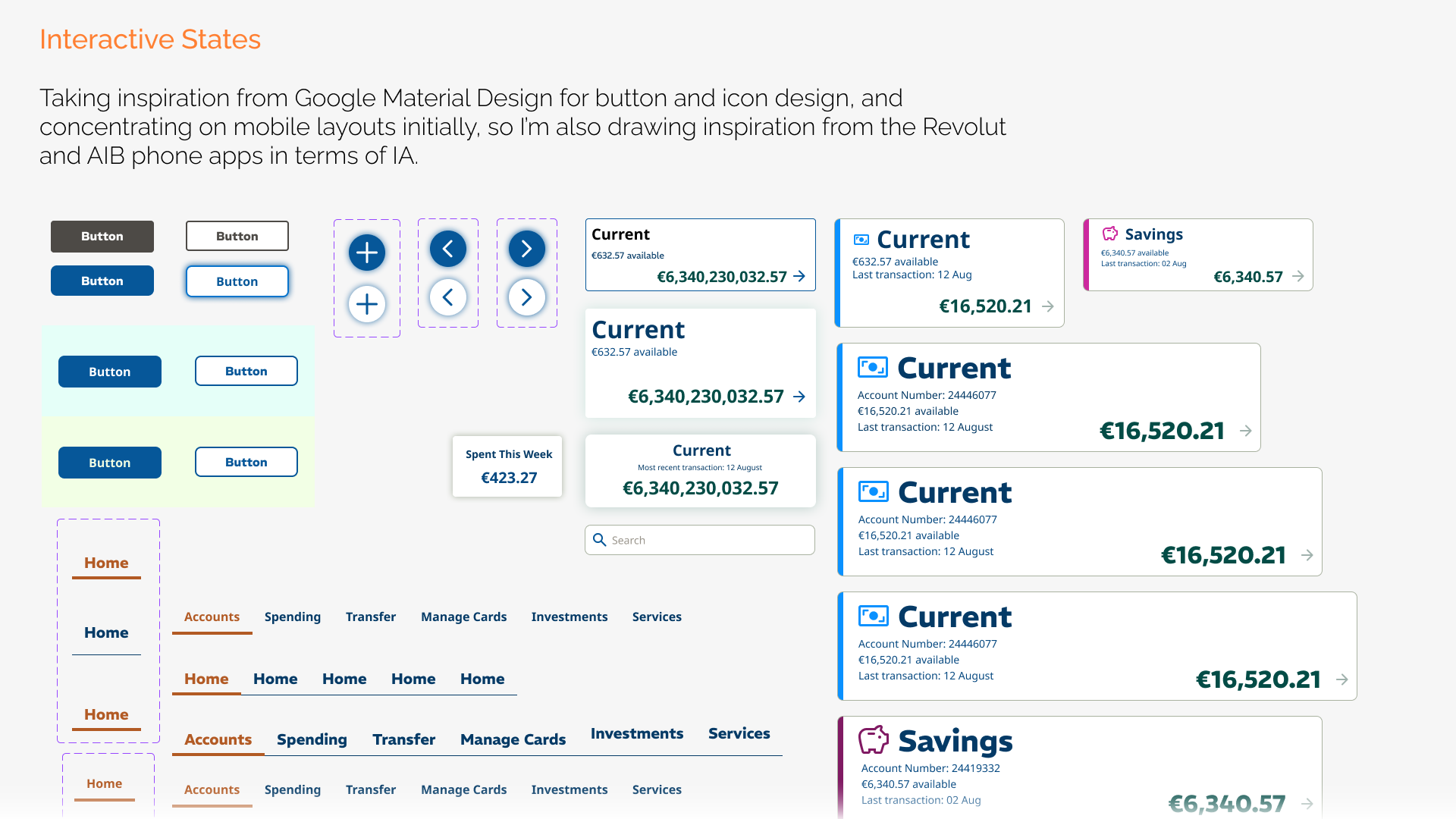
From this, the design direction began to crystallize – especially around colour and type. For colour, I drew inspiration from Monzo’s site, which balances a calm, clean base with vibrant pops of accent colour that add just the right amount of energy.
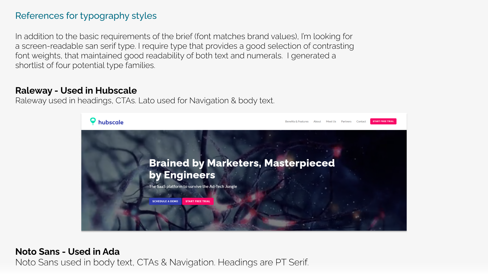
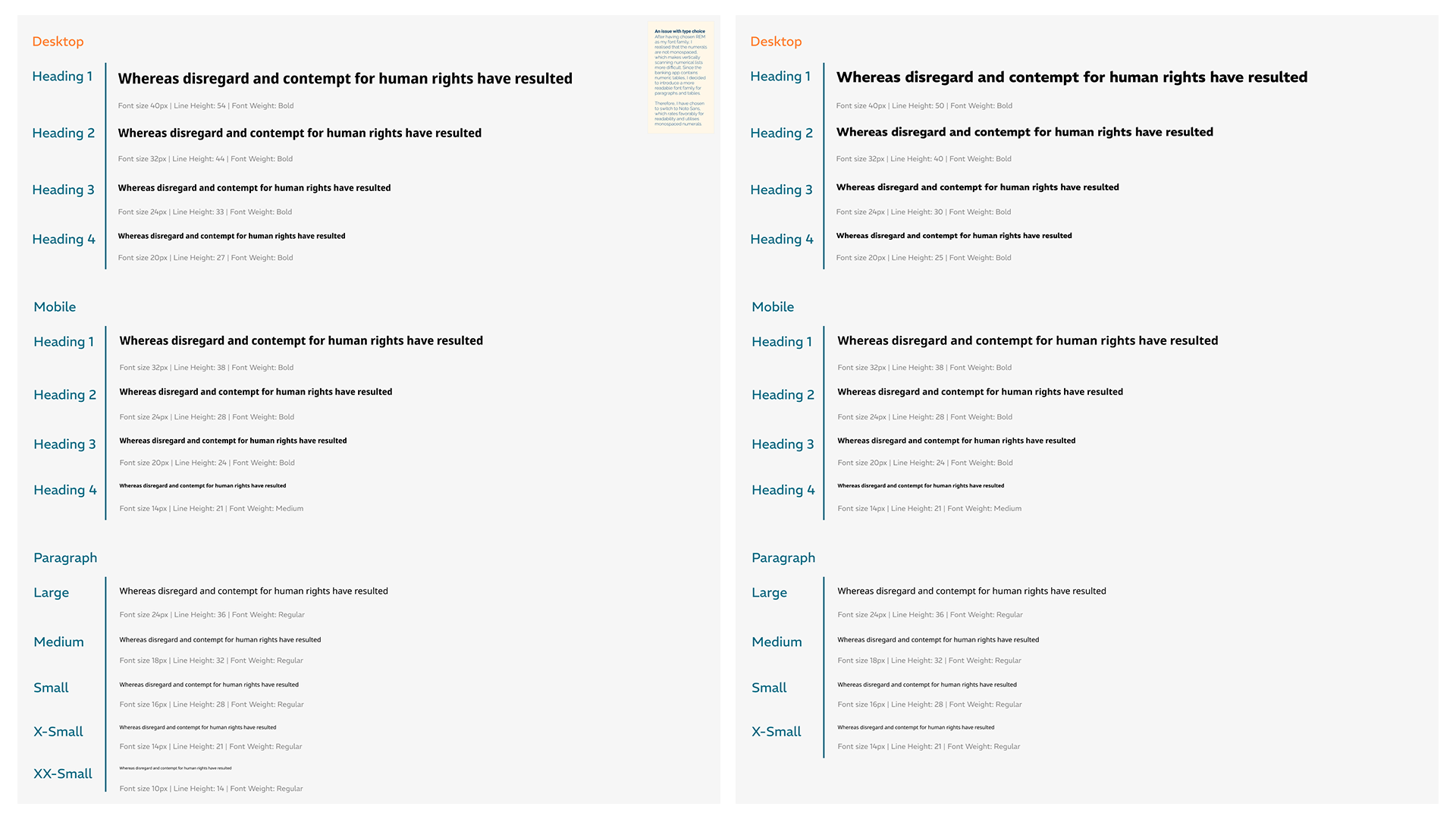
Typography required a more technical lens. I wanted fonts that were highly screen-readable yet professional. After testing a few options, I decided on Raleway and Noto Sans. I considered REM, but ultimately ruled it out since it lacked monospaced numerals – an essential detail for a financial app where numbers need to align perfectly.
For UI components, I drew inspiration from Google Material Design.
Icons, interaction, UI components, colour & type
UI development
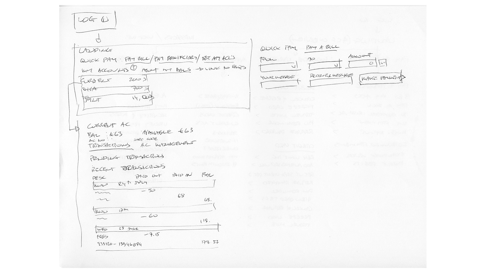
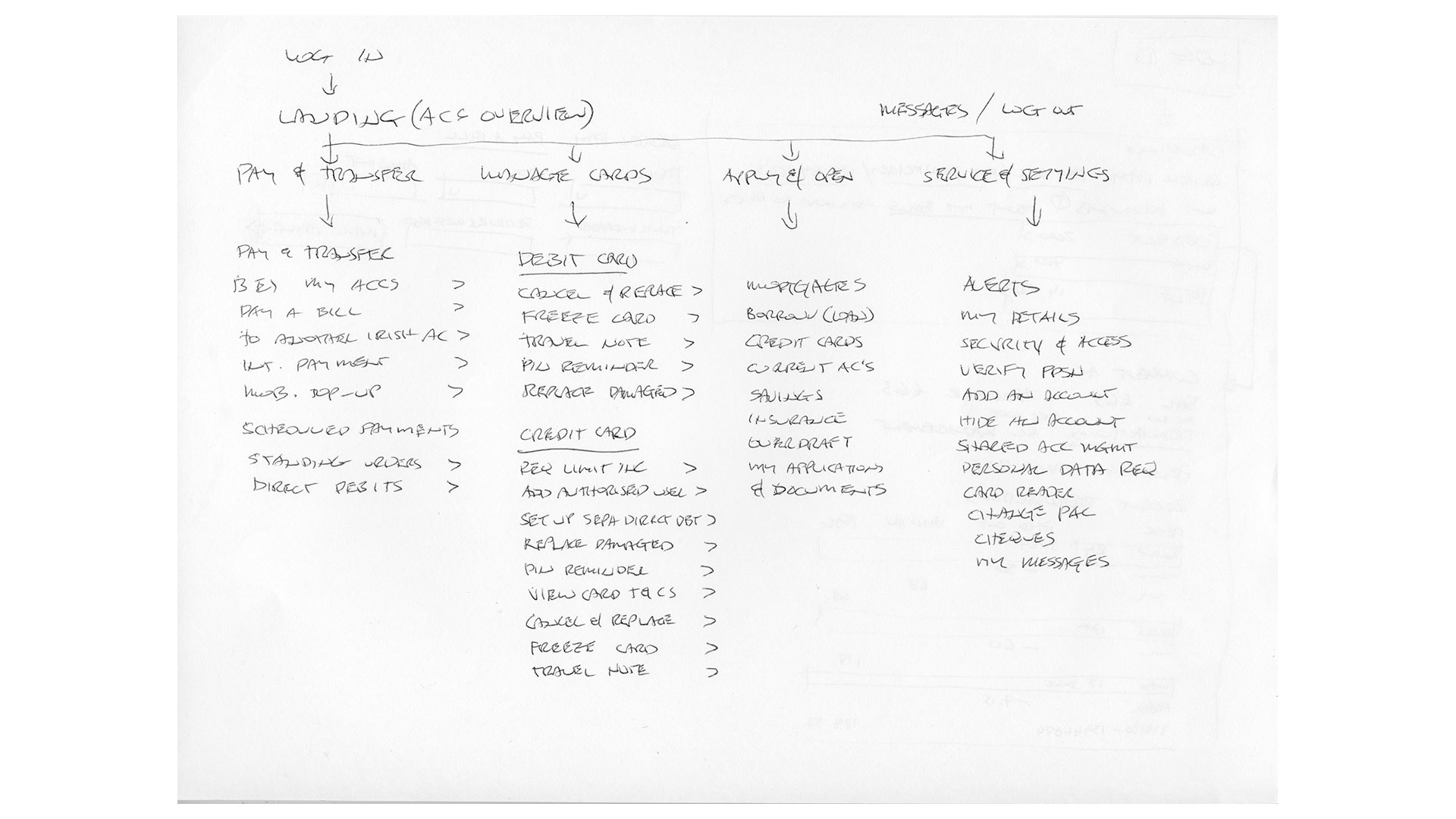
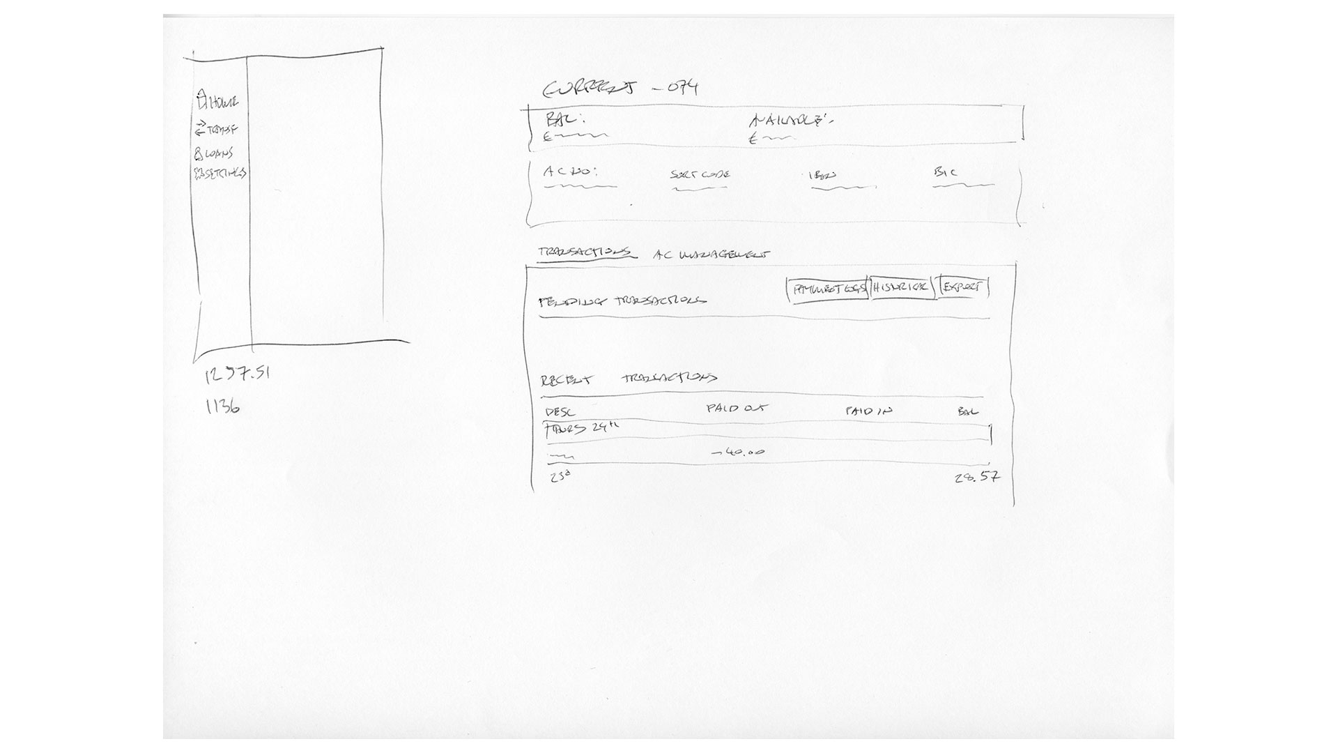
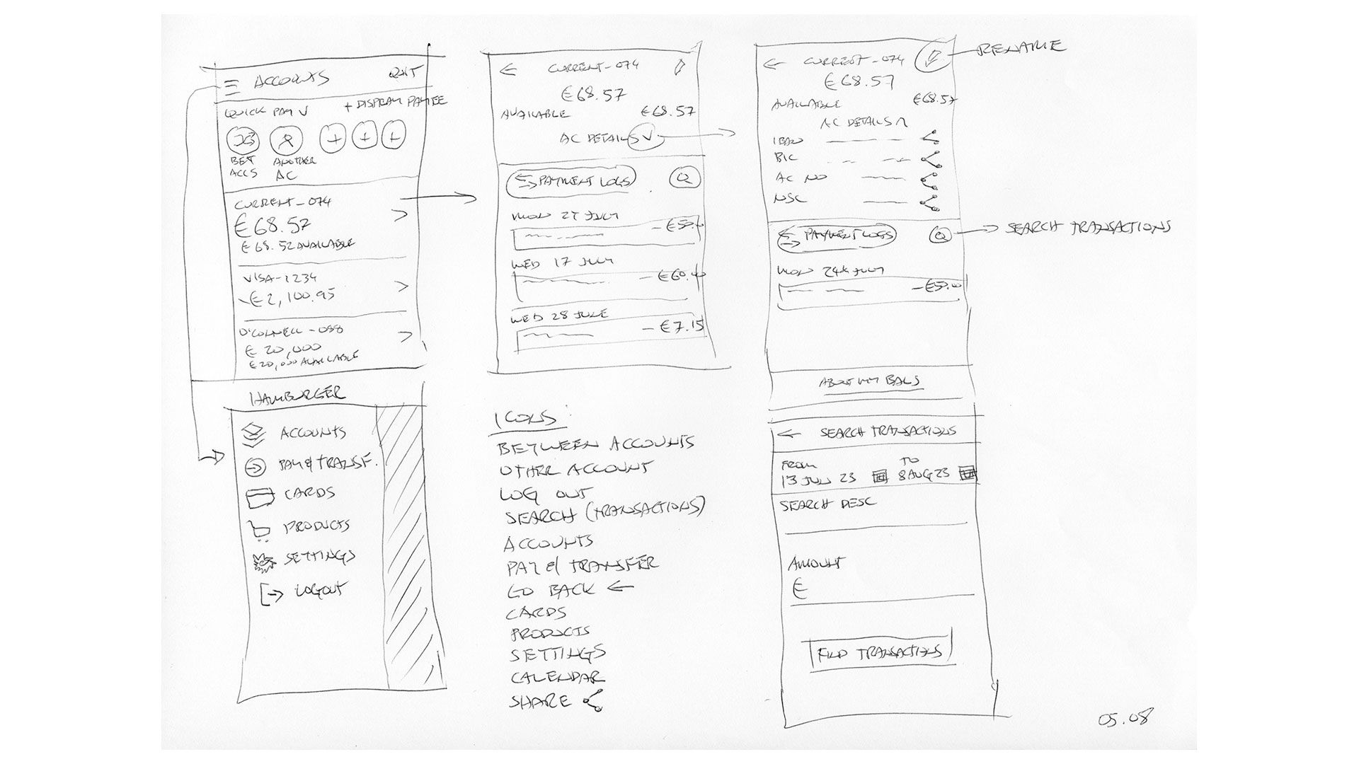
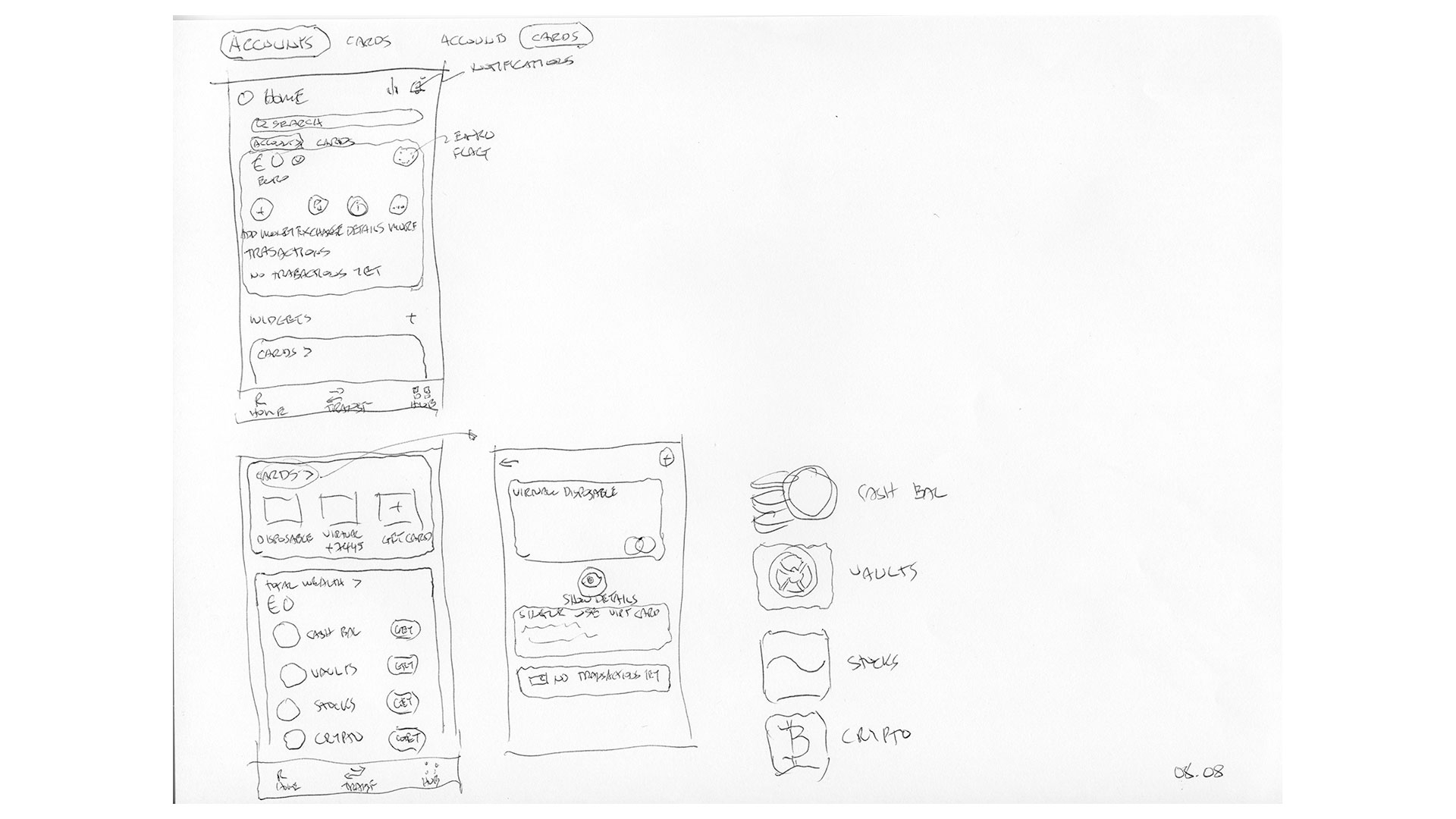
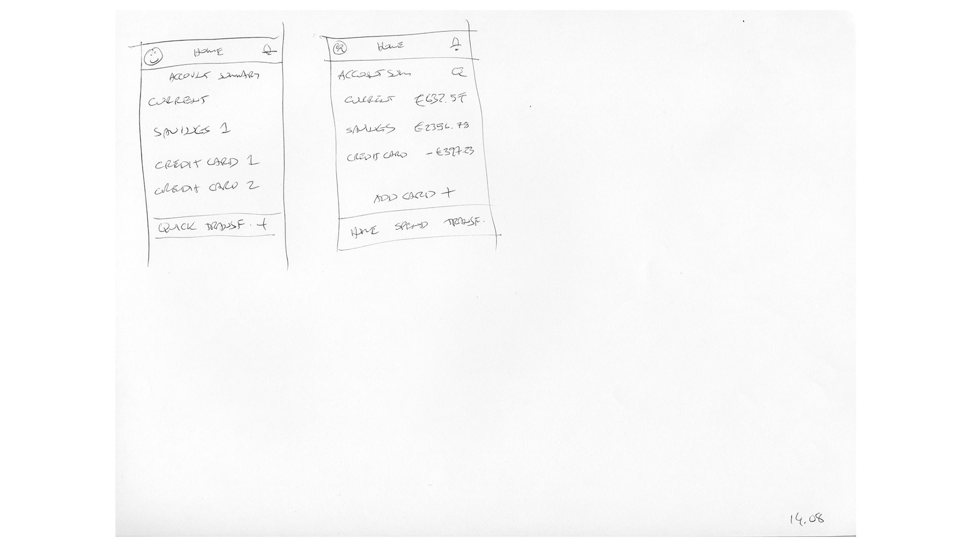
With the research phase complete, I had a strong foundation to start shaping the screen layouts. I began with low-fidelity mock-ups to explore overall structure and flow, then iterated through multiple variations to test alternatives.
Throughout this process, I shared progress with course tutors, gathering valuable feedback that guided refinements and ultimately led to the final layouts across all required form factors.
Once the designs were complete, I submitted the assignment and joined a live screen-share session with the tutors to present my work and receive detailed feedback.
UI development
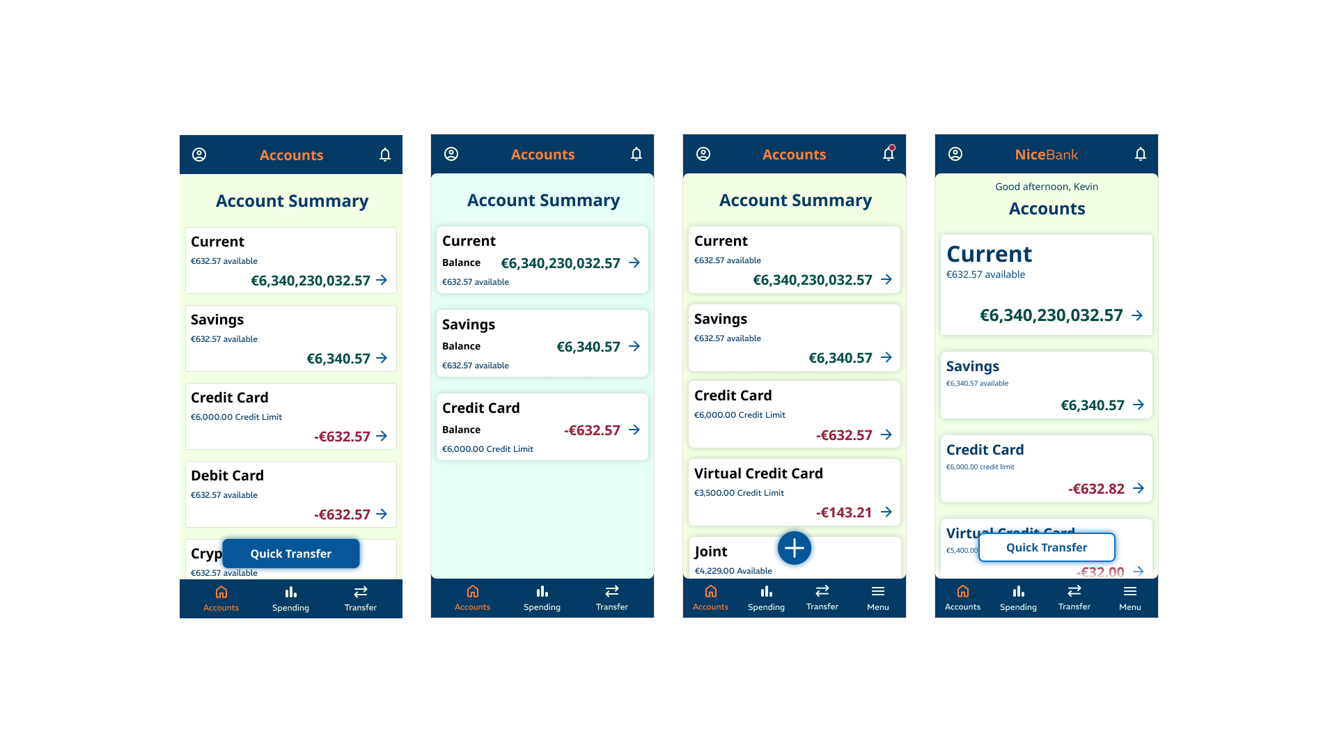
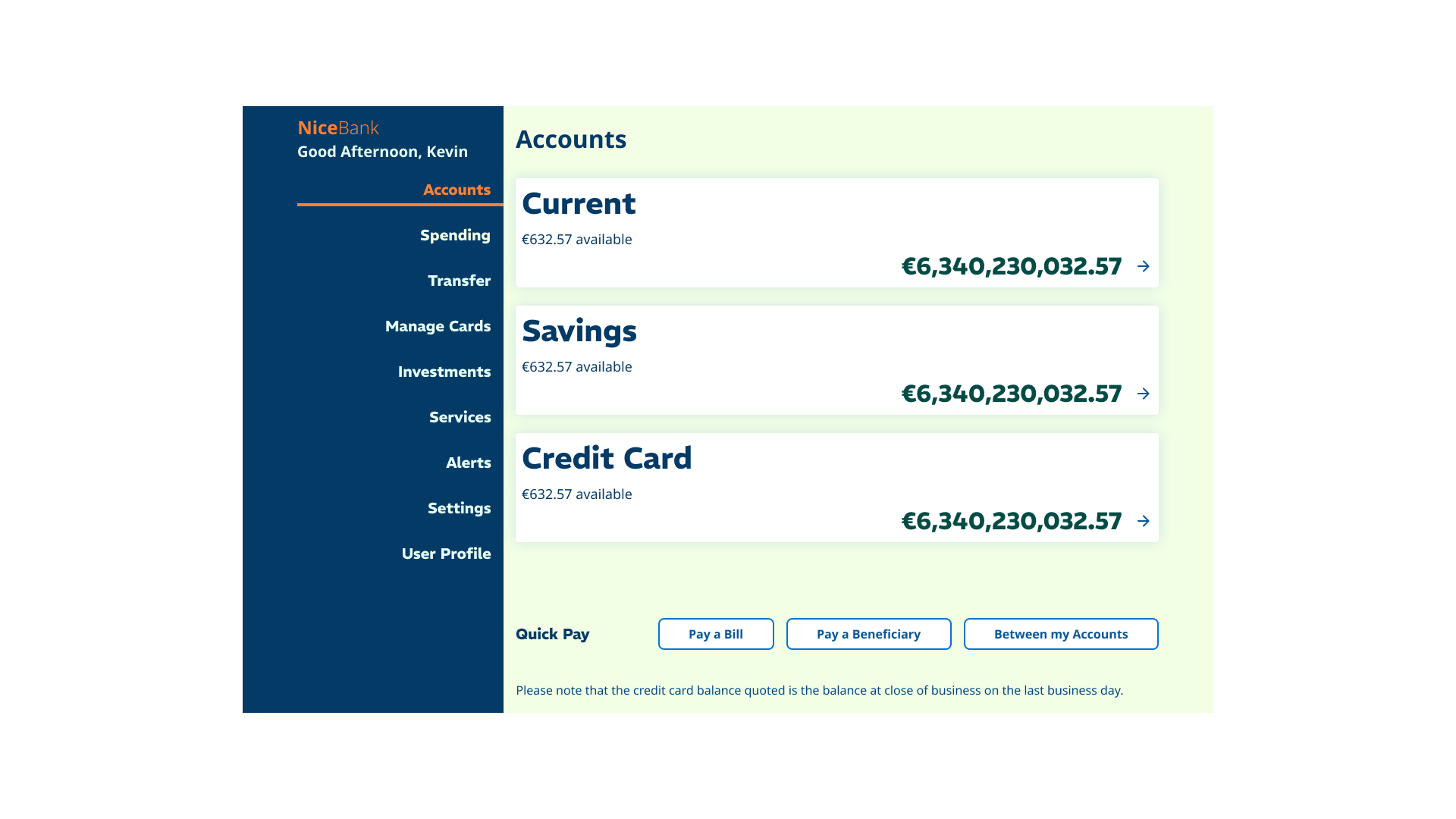
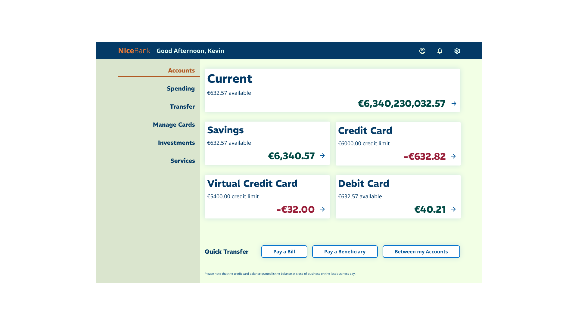
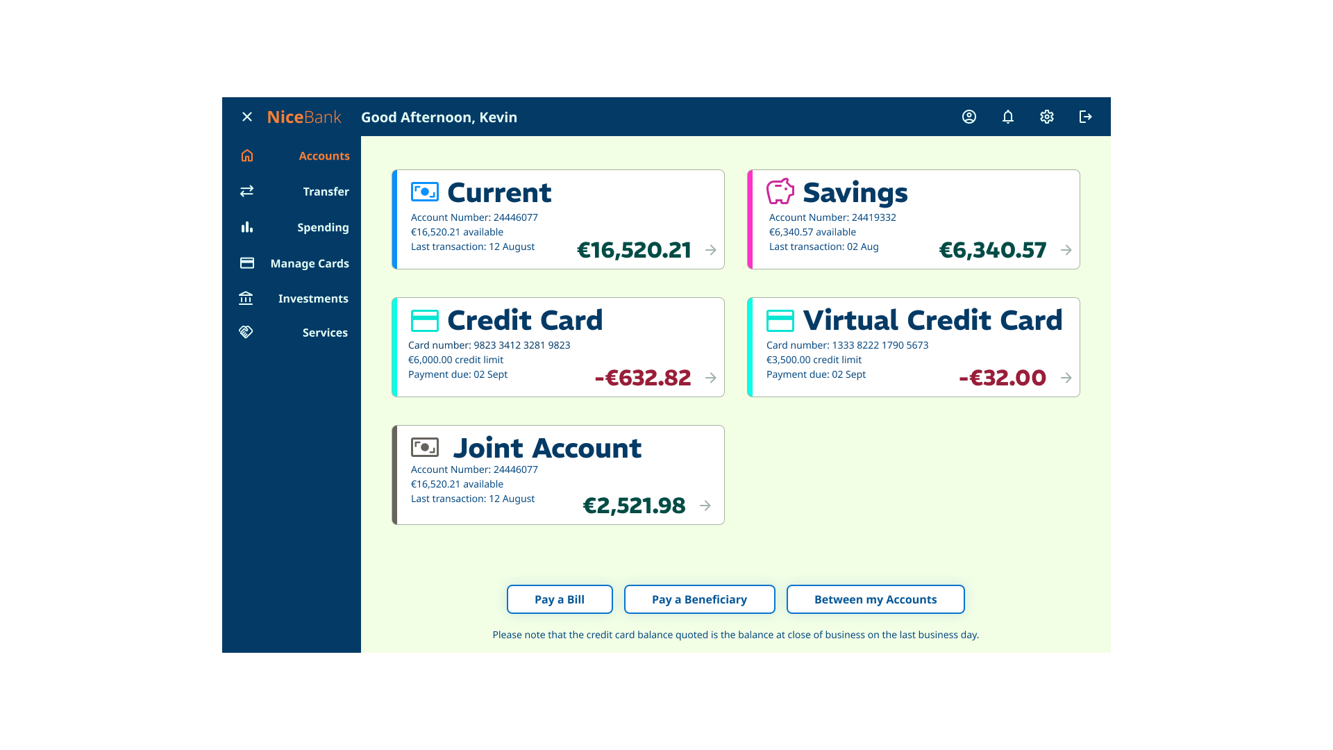
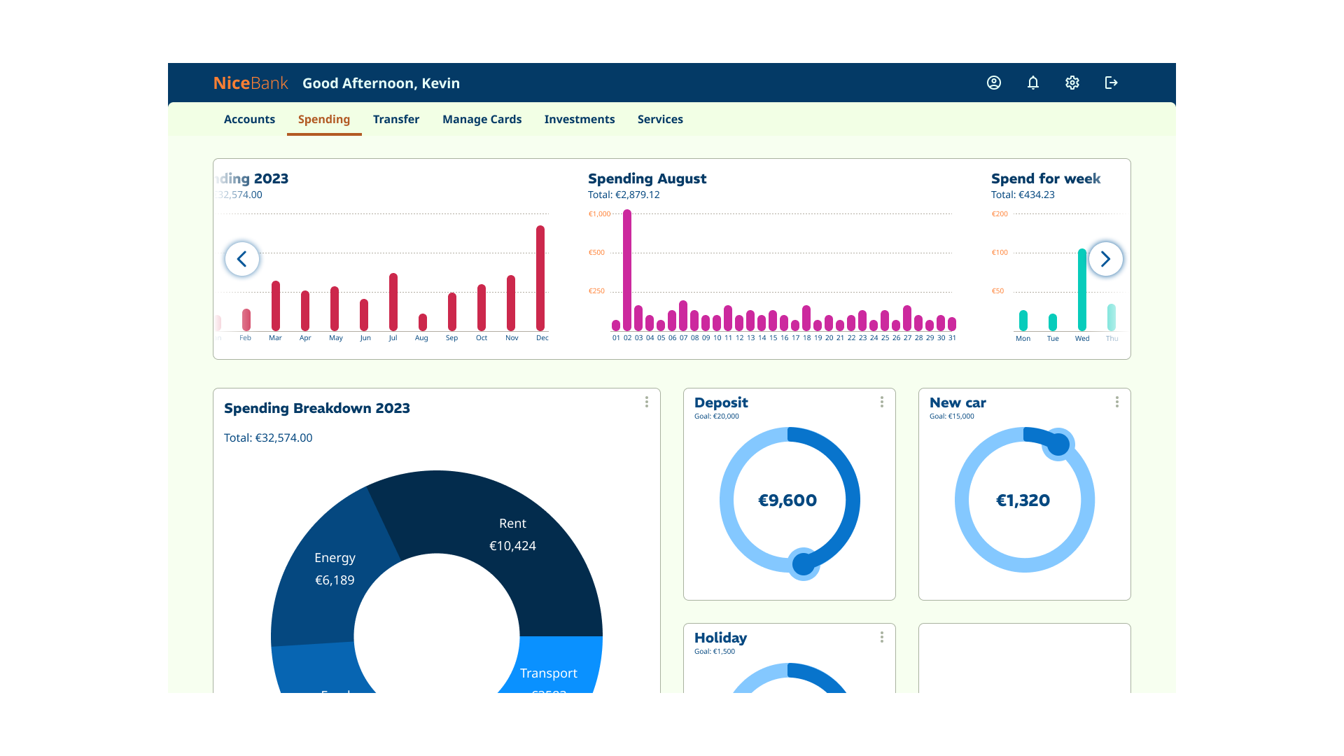
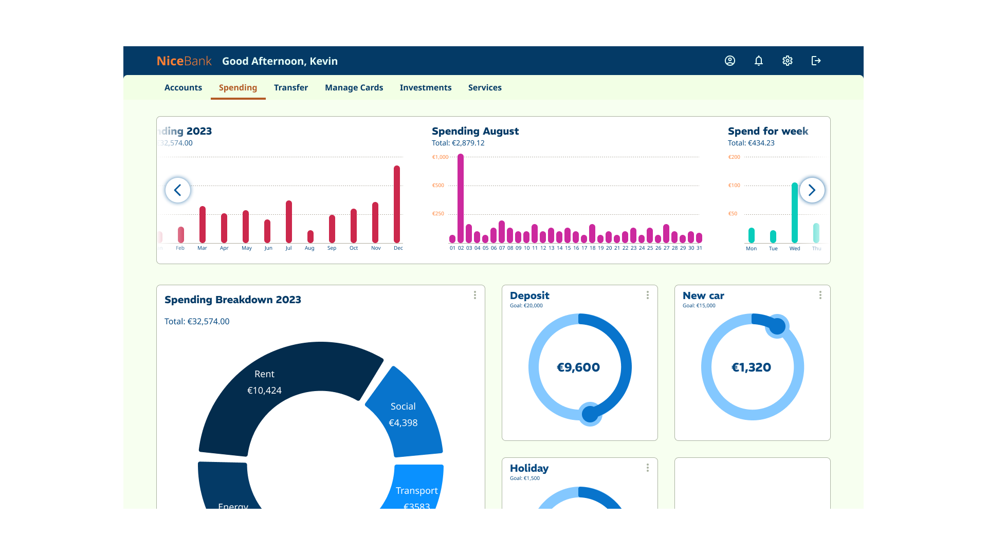
Final screens
Conclusion and final thoughts
The course was not only engaging and enjoyable, but also pushed me to think more critically about UI design. Even with years of prior experience, it expanded my understanding and gave me new perspectives on UI development.
One of the most valuable aspects was designing for mobile, tablet, and desktop. This forced me to consider different navigation patterns and adapt my solutions to make the best use of screen real estate across all three form factors.
Balancing the desired attributes of playful, clear, and trustworthy was especially challenging – particularly the playful element. I found that subtle touches of colour in the icons helped bring that sense of playfulness into the interface without undermining clarity or trust.
Typography was another learning curve. My initial type choices didn’t quite work, and it was through mentor feedback that I was able to refine both the type selection and the hierarchy to create a stronger, more cohesive UI.
Since the project only required building three screens and didn’t include user testing, I sometimes questioned whether the final design convincingly captured the feel of a real banking app. Still, the process gave me invaluable practice in balancing aesthetics, usability, and brand personality.
The project file can be accessed here: UI Cert - Assignment
